Download this map I made for Unreal Tournament 3, and read about 10 level design principles I used while making it.
Click here to download CTF-Monastery
In addition to making the map itself available for download, I’d like to share ten level design principles, in no particular order, which guided me through the level’s development.
1. Balance
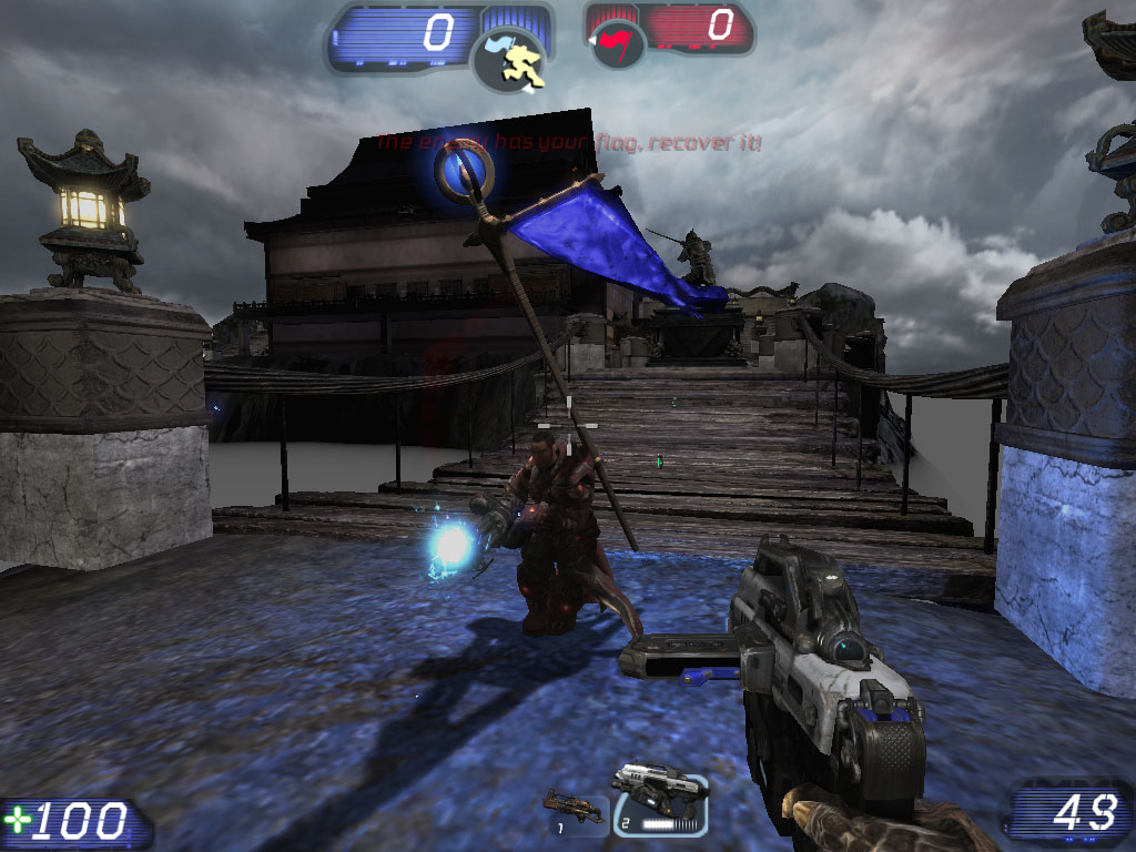
This is a capture the flag map: two teams compete to capture each other’s flag. It’s imperative that maps of this gametype are fair to both teams.
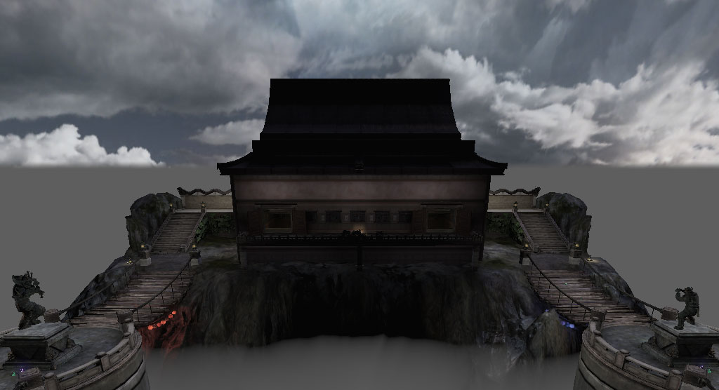
Symmetric gameplay is an easy way to insure balance. But it’s not the only way, and visual symmetry doesn’t have to follow. In this map the terrain is subtly different on either side, especially at inaccessible areas. As we’ll see later, the color-coded lighting is different, and the dominant light source (the sun) comes in at an angle. Each side has a different monumental statue, which sets up the tension of two opposing sides: balanced, yet unique.
This map took me a week to go from concept sketch to playable beta. Symmetric maps are easier to create, and more approachable for the player. Players know what to expect on the other half of the map once they reach the midpoint.
2. Atmosphere
A good map pack is like a new flavor of ice cream. The new ingredients create a novel experience, but it’s still ice cream, so you know it’s going to be good. This map has a consistent East Asian theme to it, which on a practical level allowed me to re-use UT3 assets like textures and static meshes.
But you don’t want a generic re-hash, you want something that feels new. I tried to invoke feelings of peril and acrophobia with the open rope bridges taking you between the rocky peaks thrusting out of an infinite, impenetrable fog. Though the layout was adopted from an earlier design I had, the atmosphere was inspired in part by the rope bridge scene from Kung Fu Panda.
3. Cover
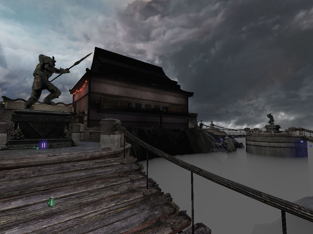
Even if your game doesn’t use explicit cover points, the level designer needs to think about cover. I wanted a long, perilous bridge connecting each base to a central building. But a single long rope bridge would leave the player too exposed. That’s why I split each rope bridge into two halves, bisected with a large stone pillar (on the left in this screenshot). The pedestal in the center of the pillar is big enough to hide behind, and the stone railing around the perimeter is big enough to block fire from most angles.
4. Reward
Now, look at this same screenshot from the sniper’s perspective. Taking up this sniping position requires crossing that same dangerous rope bridge. Now it’s payback time! The player has earned a superior position, and players can accept this so long as it’s not a domineering, foolproof tactic.
5. Danger
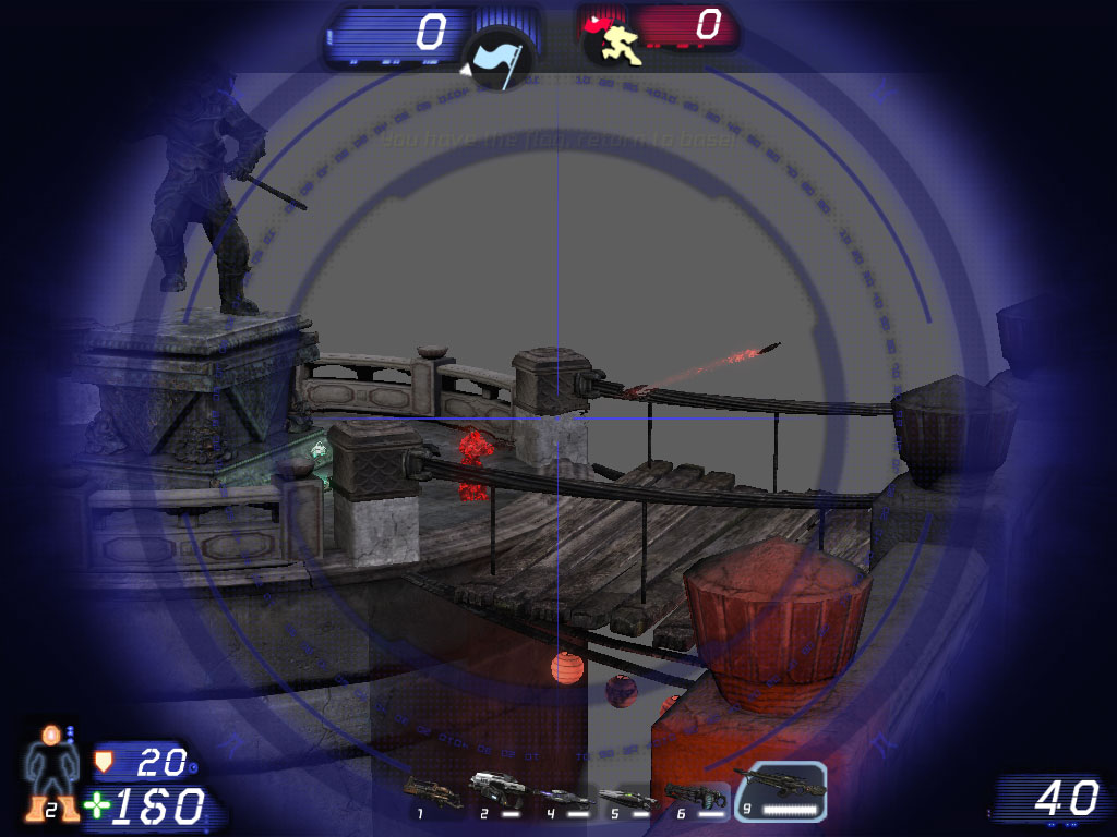
There’s also such thing as too much cover. A spot that’s too safe just invites camping. When on the rope bridges themselves, you are very exposed. Though it’s wide enough to weave from side to side, there’s only one path to get from one end of the rope bridge to the other. Through this span you are open to enemy fire from the front, the back, the bridge on the other side of the map, and the sniper gallery in the distance. Players feel a sense of relief when they duck into the central building, having survived a sprint through the danger zone.
6. Identification
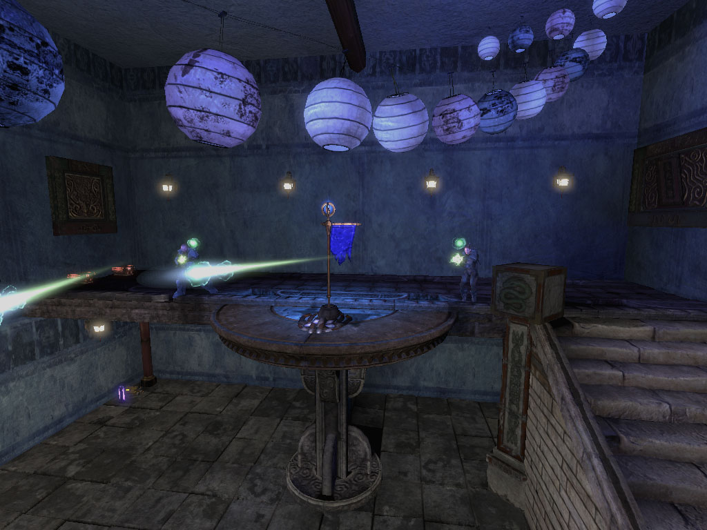
Monastery has a lot of symmetry and repeated elements. Yet each part of the map must be visually distinct. There’s nothing worse than getting confused and running back to the wrong base!
For this map, I put Chinese lanterns on the walls to distinguish red team, blue team, and neutral areas of the map. The lanterns were an ideal choice, as they already existed and looked natural even when strongly tinted. The lighting is also colored, and the walls in the base rooms themselves use a warm or cool texture variation.
At any point in the map, you can find visual cues indicating whether you’re on the safe or dangerous side for you: whether you should be attacking or defending the area.
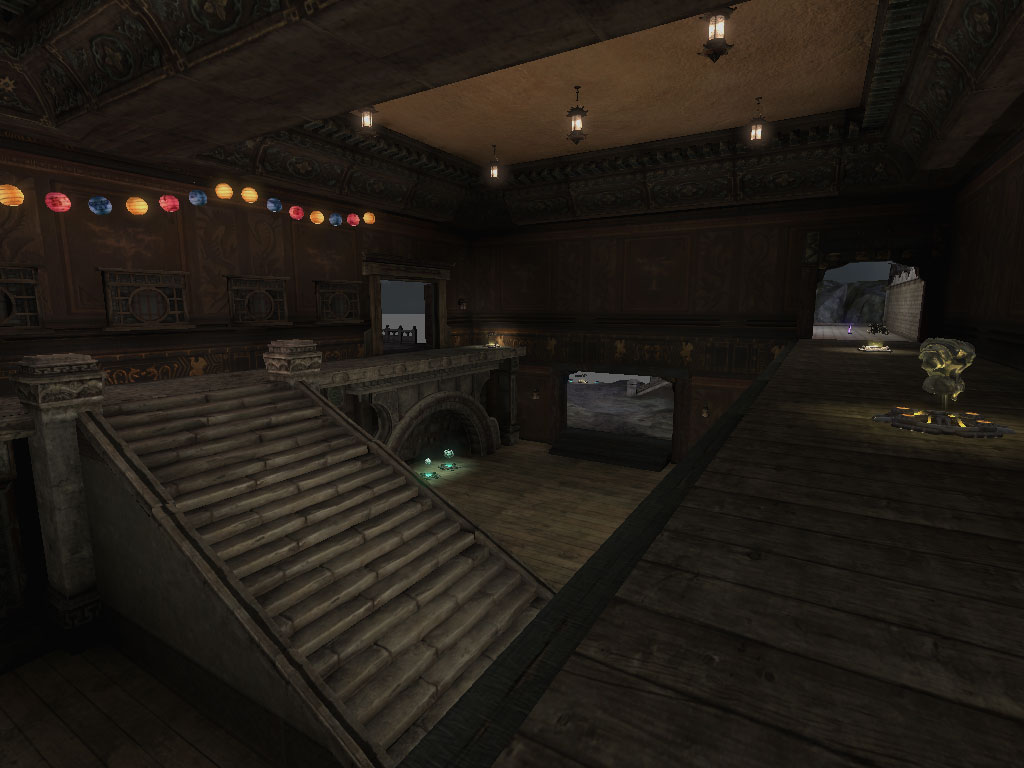
7. Discovery
There’s an armor powerup behind the staircase shown in the last screenshot. But you’re not thinking about that; you’re thinking about the two flag defenders shooting at you. The powerup is not hidden, so much as it’s out of the way.
You can encourage players to walk to the far corners of your map if there’s something to find. Reward players willing to explore, and you can increase the effective area over which players will travel, without expanding the map’s physical size.
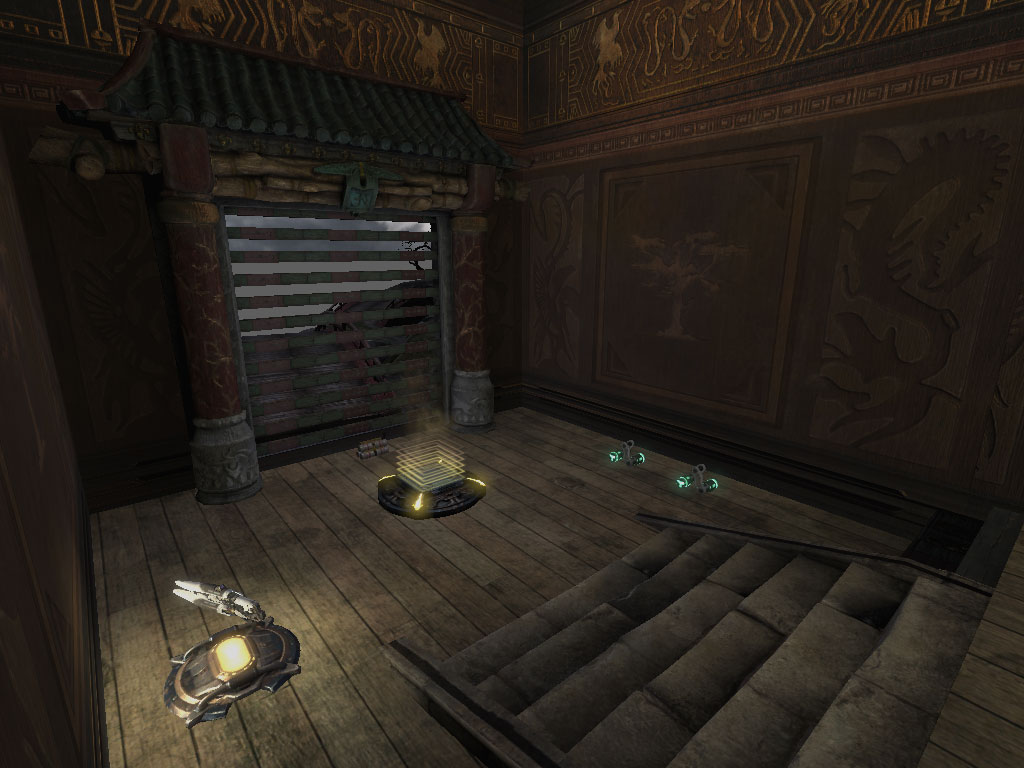
8. Anticipation
You can tease the player by making it obvious where something good is, but obscuring the path to get there. Here, there’s body armor on the platform on the far right. However, there’s no ramp or staircase leading up to the armor in this building, and you can’t reach it by jumping either. A player drooling over that body armor from the ground has to get to it indirectly: either by exiting the building and climbing a staircase on the outside; or passing underneath the armor, then standing on a jump pad which launches the player up and onto the platform. It’s a little puzzle that takes a few seconds to solve, which keeps the level from staying too straightforward and linear. Which segues nicely into rule 9…
9. Options
Good flow comes from having several routes from a given point. In the last screenshot, there are clearly at least three paths you can take as a player.
- Stay on the platform you’re on and take the right exit
- Step off the ledge and take the lower exit
- Jump onto the staircase and take the left exit
When you have the flag and a group of enemies are shooting you in the back, you need a choice so that your next move isn’t completely predictable.
Also, all three paths look different in the vertical dimension. A cliff or ledge is a simple way to make a path work one way. In UT3, the translocator and jump boots open up more possibilities by effectively extending the player’s jump height.
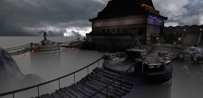
10. Expanse
We’ve come a long way from the caves & corridors of yesteryear. Players want to feel like they’re in an actual place, and the real world goes on and on for thousands of miles. You can’t model a thousand square miles at this level of detail, so it has to look like the player is merely confined to a tiny subset of an expansive world.
A box canyon wasn’t going to cut it for this map, so I surrounded the play area with a heavy, deadly fog that extends to infinity. But there are also implied areas you can never reach. The screenshot shows a dead end layout-wise, but it looks like an entryway to a long winding path of wooden bridges. At the same time, the wooden slats make it unambiguous that there’s no path. Invisible walls are frustrating, and you don’t want players wasting time trying to get out when they can’t.
← Back